Meet the Illustrator: Jon Agee
by the Brightly Editors
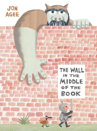
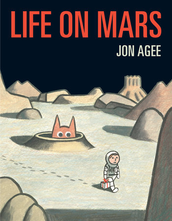
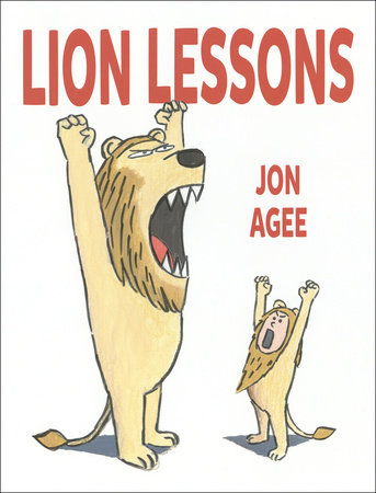
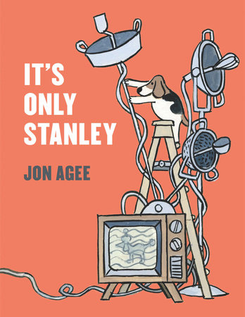
Jon Agee is the author and illustrator of acclaimed reads such as Terrific, Milo’s Hat Trick, Little Santa, It’s Only Stanley, Lion Lessons, Life on Mars, and a delightful new release, The Wall in the Middle of the Book. We chatted with Jon about his favorite reads growing up, the many illustrators who inspire him, and the joy of seeing comical things happen to adult characters in children’s books.
What first made you excited about art?
When I was young, my mother — an artist — encouraged my sister and me to draw. There were always boxes of colored pencils available, and magic markers, which were the latest thing. It was the 1960s. We had Spiro-graph, Silly Putty, and Etch-a-Sketch. One summer weekend, my sister and I did a series of abstract, psychedelic pictures, and sold them for 25 cents apiece at the end of the street. We made posters about “Conservation” and “Saving the Environment.”
Mostly, I enjoyed drawing things in motion: airplanes, race cars, and sports players, because of their colorful uniforms and acrobatic poses. I also drew comics — influenced by Tintin and The Hardy Boys — featuring detectives on the hunt for bad guys.
What illustrated book from childhood has stayed with you over the years?
Edward Lears’s A Book of Nonsense was a revelation. I loved the limericks most of all, where grown-ups are doing ridiculous things to themselves and others. Lear’s unique perception of adults certainly informed my work, for at least 20 years, when my books mostly featured protagonists who were middle-aged men in comically absurd situations.
Where do you find inspiration for your illustrations?
Looking at things. All kinds of art — in books, museums, photographs, movies, and music, on the street, and in life going on around me.
I also admire many children’s book illustrators: Tomi Ungerer, John Burningham, Andre Francois, Jules Feiffer, Leo Lionni, and more recently Jon Klassen and Christian Robinson. The list goes on.
What does your workspace look like?
I work at home in a messy, cluttered room with various stacks of drawings and multiple versions of pictures lying among other papers, packages, notepads, and such — all stacked here and there, on the floor, on top of books and boxes. Eventually, I spend a day or days putting almost everything in its proper place. There is also a long wall to pin up all the pages of the book I’m working on, so I can see it coming together.
I work at two desks: one near the art supplies, for making pictures, and the other, with computers on it, for writing (and fine-tuning pictures). I have a big bookcase filled with stuff I like to look at such as picture books, art books, poster books, cartoon books, sketch books, reference books, and so on.
There is also a little nook for my dog to sleep in.
What materials do you most like to use?
I go through phases with materials, based on the kind of story I’m illustrating or the look I want to achieve. Many years ago, I worked in an agonizing method, laying down dense watercolor over delicate print-making paper, then finishing the picture with a dark charcoal line. There was no room for error. It’s no wonder my next series of books were done in a looser, more forgiving method, using pen and ink with washes of watercolor. Later, I worked in a dark, scratchy pencil line, and these days I’ve been using mostly a brush.
What design resources would you recommend to young artists?
I remember a book about creating with paper … In fact, that was the title: Creating with Paper. It had countless examples of things you could do, from simple cut-out shapes, to elaborate folding, curling, and weaving effects. There are many books about design — poster design, book design, advertising, etc. Looking at art in general is a good way to appreciate design. Drawing from life is also very helpful!
What’s the best name for a color that you’ve ever heard?
“Lapis Lazuli.” It’s a semi-precious blue stone that can be ground into pigment for painting. If you look at paintings from the 1600s (like Vermeer), you’ll see that Lapis Lazuli blue was used sparingly and in distinct areas, because it was rare and very expensive. Luckily today’s painters have access to a wide range of reasonably priced blue pigments.
-
Books by Jon Agee
-
The Wall in the Middle of the Book
Also available from:Life on Mars
Also available from:Lion Lessons
Also available from:It’s Only Stanley
Also available from: -
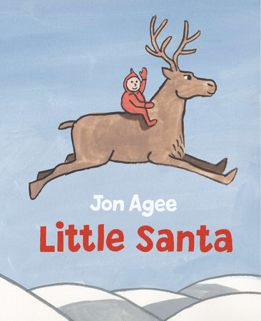
Little Santa
Also available from:
Jon Agee is the beloved author and illustrator of many acclaimed picture books, including Terrific (a New York Times Best Illustrated Book), Milo’s Hat Trick (an ALA Notable Book), Little Santa (an ALA Notable Book and recipient of five starred reviews), and It’s Only Stanley (a Boston Globe-Horn Book Award Honor Book). He lives in San Francisco, California. Visit him online at jonagee.com.

